Aaron L. Post
www.aaronlpost.comYou are here! This is my playground, my portfolio, my experimental slate from which to tinker with new things. Some pieces may be broken. Some parts may be assembled incorrectly. But ultimately this is where I have learned a lot about how to design for the web. Below are some more details about how this site came to fruition.

Insider Making
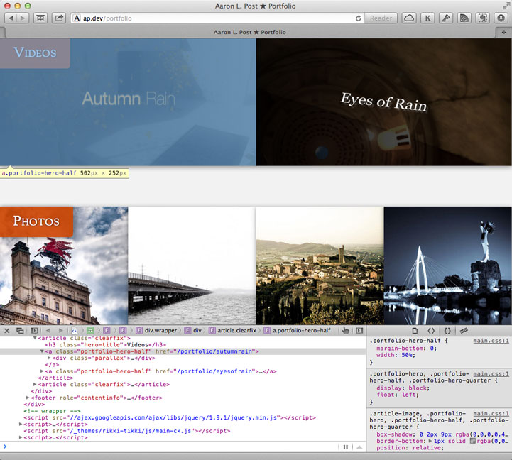
The most effective way for me to design my sites is in-browser. First I made rough mockups on paper and moved only briefly into Photoshop when necessary. Once the base code was down, a large number of decisions were made inside the browser itself using the Inspector. This allowed me to make quick iterative changes that accurately reflected what the final audience would experience across a wide range of devices. I also discovered my love for sketching on notecards. Lots. Of. Notecards.

Ch-ch-ch-ch-changes
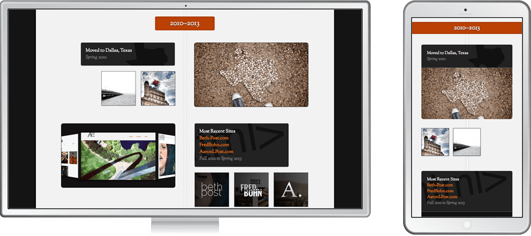
Responsive design was again a focus of mine. Increasingly, people are experiencing the web on devices other than just the desktop. As designers we must be more flexible in our approaches to account for differing device sizes and capabilities. Here, I used SASS media query mixins to adapt to changing viewports easily. More challenges came when dealing with the quirks of different browsers (I'm looking at you Android). While I addressed screen size, file size optimization, especially on mobile, is still an opportunity.
