Fred Bohn
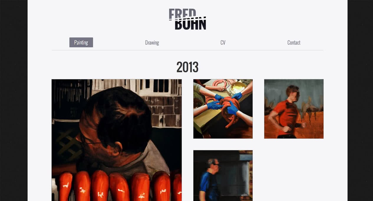
www.fredbohn.comBohn. Fred Bohn. Does not approve of cheesy Bond jokes. But he does paint and draw really cool artwork in and around Wichita, Kansas.

Less LESS, More SASS
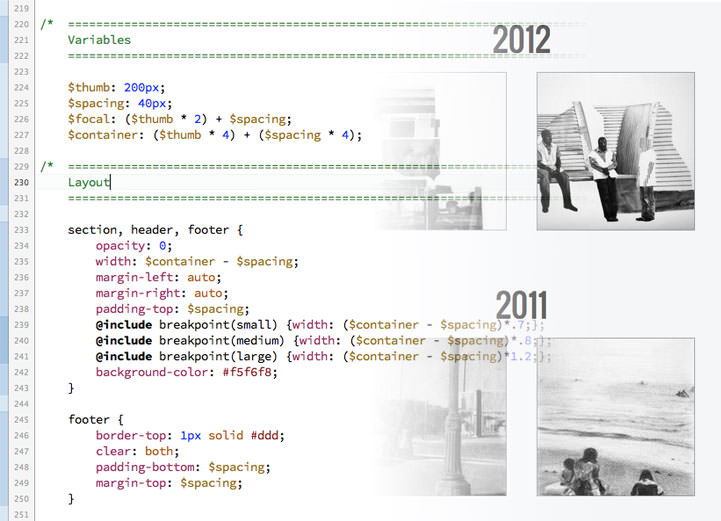
I was introduced to CSS preprocessors, specifically LESS, during the development of Beth’s site using Twitter Bootstrap. For Fred’s site I took a different approach and started learning SASS, using the HTML5 Boilerplate as a foundation. SASS allowed me to set up variables and math operations within the CSS (and practice my nerd skills). This meant changes to the layout could be tested super fast within the browser just by changing a variable or two.

Stretch Art-strong
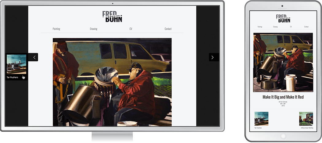
A good responsive design approach doesn’t only address how a site looks across a variety of devices, but also how it works. Different devices sometimes call for different interaction. Fred’s site relies upon navigation arrows that expand on hover to reveal previews for additional artwork. Spiffy on the desktop with a mouse, this approach falls flat on mobile without hover. So I used media queries to collapse the previews to always be visible at mobile sizes.

Automagic
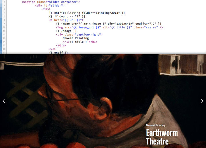
I wanted to give Fred an easy way to add new artwork and not only have it appear in his portfolio, but also on the front page. Once again I turned to Statamic. Using the most recent drawings and paintings uploaded, the images are automatically resized and presented with titles in a carousel. New uploads are automatically replaced, leaving Fred with more time to create more awesome artwork.
